Gallery Lighting Design: How to Light Art the Way It Was Meant to Be Seen
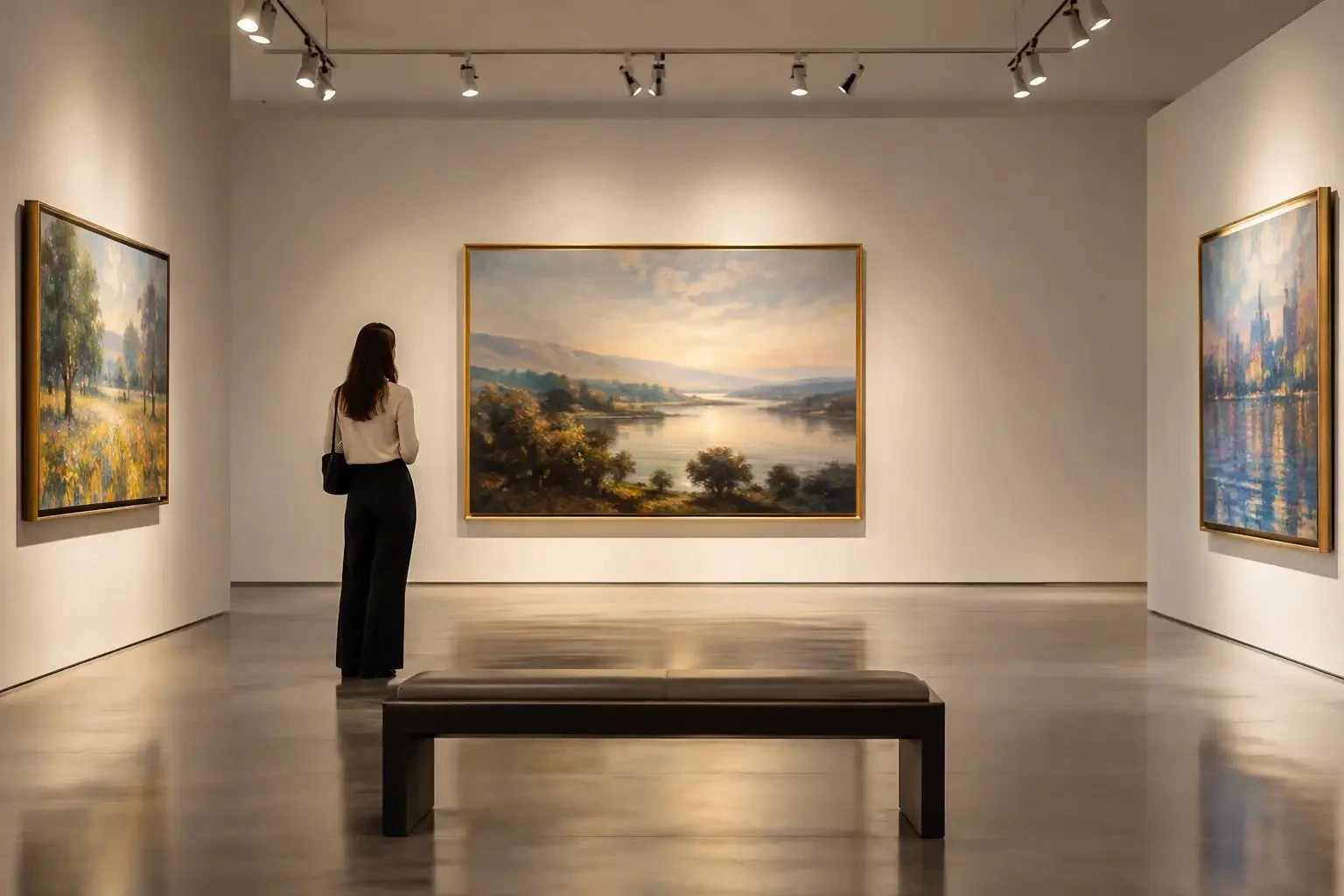
A painting can be correctly hung, expertly framed and thoughtfully placed, yet still lose its presence under poor light. Gallery lighting design decides whether a viewer meets the work as the artist intended: colour relationships intact, surface legible, atmosphere undisturbed.
For galleries, museums and collectors in Malaysia, this is more than making art visible. It means balancing visual clarity, conservation, architecture and the needs of each object. A luminous oil painting, a delicate work on paper, a reflective photograph and a textured sculpture cannot all be lit the same way.
Start with the artwork
The best lighting plans begin before any fixture is chosen, with close observation of the work: medium, scale, palette, finish, age, condition and viewing distance. A dark tonal painting needs controlled light to reveal depth without flattening shadow. A work on paper needs lower light because exposure is cumulative. Gloss varnish, glazed photographs and polished sculpture bring a further risk: glare can dominate the image.
That is why a single uniform solution rarely works. Consistency across a gallery matters, but sameness does not. The aim is a coherent room in which every work is seen accurately.
Light levels are a curatorial decision
Brightness sets hierarchy, atmosphere and pace. Overlighting can make a gallery feel commercial or aggressive, while too little light hides detail. For conservation-led collections, levels must also reflect material sensitivity over years of display, not only how the work looks today. Weigh illuminance against duration, rotation and daylight, and treat dimming as an essential tool rather than a convenience. Our guide on how to prevent light damage to artwork covers this in more depth.
Colour quality is not a decorative detail
Art is judged through subtle distinctions: the coolness of a grey, the transparency of a glaze, a deep red against a red-brown. If the light shifts those relationships, the viewing becomes unreliable.
Colour rendering. High CRI is fundamental, but one score does not tell the whole story. Test whether the artwork keeps its colour balance, tonal range and material character.
Colour temperature. Warmer light can suit traditional materials and intimate rooms, neutral white often suits contemporary painting and photography. See museum lighting colour temperature for how to choose.
Consistency. Mixed white points make a room feel unstable. The eye should not have to recalibrate from one wall to the next.
Direction reveals texture, and creates glare
Frontal light gives even coverage but can hide impasto and relief. More directional light reveals texture clearly, yet can exaggerate irregularities or cast disruptive shadows. For glossy paintings and glazed works, place fixtures with the viewing position in mind: a lamp that looks well aimed from a ladder can throw a broad glare field at eye level. The goal is not to remove every reflection but to keep reflections out of the viewer's way. Our article on reducing glare on framed art explains the geometry.
Beam control creates visual order
A beam should belong to the artwork, not spill onto walls, labels or walkways. Narrow beams suit small works and sculptural accents, wider distributions suit large paintings and groups. Wall-washing helps general visibility but should not replace dedicated accent light.
There is a trade-off. High contrast is dramatic but can make labels hard to read and let secondary works disappear. Even light is more accessible but less theatrical. Let the exhibition's purpose decide the balance.
Manage daylight, don't romanticise it
Daylight brings life to a room, but it changes constantly in intensity, colour, glare and ultraviolet. In Malaysia's strong sun, a gallery that feels perfect in the morning can be hard to control by afternoon. Filter, shade and monitor it, especially where sensitive works are on show, so it does not compete with the exhibition lighting.
Plan, focus and review
Survey the works and note their sensitivity, finish and size.
Set the intent for each room: contemplative, energetic, highly legible.
Specify fixtures for colour quality, beam options and smooth dimming.
Focus on site with the art installed, from the visitor's real viewing positions.
Review regularly as exhibitions change and daylight shifts with the seasons.
Frequently asked questions
What is the most important part of gallery lighting design?
Starting from the artwork. Medium, surface, sensitivity and size should decide the light, not the other way round.
Should every artwork in a gallery be lit the same way?
No. The room should feel coherent, but each work needs light suited to its material and scale.
Is daylight good for galleries?
It can be beautiful, but it must be filtered and controlled to protect sensitive works and keep colour consistent.
Gallery lighting from Nuray Lab
Good gallery lighting is felt rather than noticed: the work simply looks like itself. Explore Nuray Lab's art lighting and products, or contact us to plan lighting for your gallery or collection in Malaysia.