Museum Lighting Colour Temperature: Choosing the Right Kelvin for Art
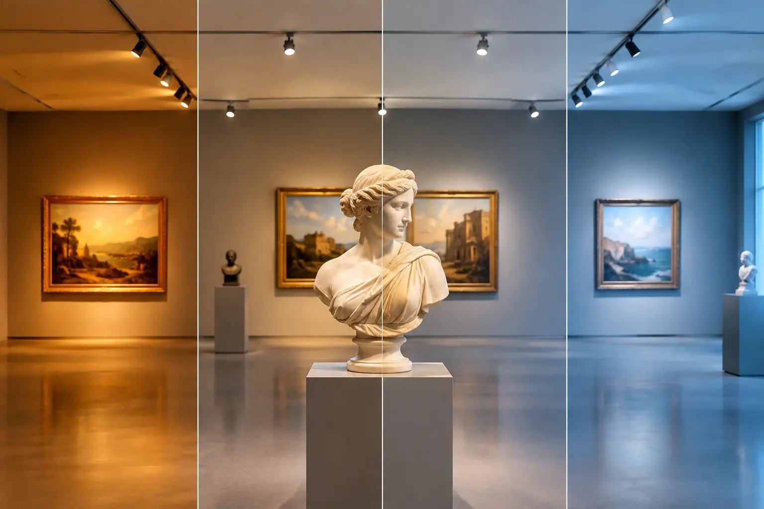
A painting can be accurately catalogued, carefully framed and impeccably installed, and still be misread under the wrong light. Museum lighting colour temperature affects the perceived warmth of a palette, the clarity of a white ground, the depth of a shadow and the atmosphere of the room. It is not a decorative preference. It is part of how an artwork is encountered.
For museums, galleries, collectors and artists in Malaysia, the aim is not to make every work look brighter or more dramatic. It is to create conditions in which the work can be seen with integrity, while respecting its materials and the artist's intent.
What colour temperature actually controls
Colour temperature is measured in Kelvin (K) and describes the apparent colour of white light, from warm and amber at lower values to cool and bluish at higher ones.
2700K. Warm and intimate.
3000K. Still warm, but closer to neutral.
3500K. Clearer and more contemporary.
4000K. Crisp, cool and closer to daylight.
Kelvin is only one part of a lighting specification. Two fixtures labelled 3000K can render the same painting quite differently because their spectra differ. Kelvin sets the overall atmosphere. Spectrum determines much of what the eye actually recognises within the work.
Warm or cool: neither is automatically right
Warmer light is often chosen for historic interiors, Old Master paintings, wood and gilt frames. At 2700K to 3000K, gold leaf looks richer and the room gains a measured intimacy. But a cool grey painting, a contemporary photographic print or a work built around blues and high-key whites can lose separation under a source that is too warm. Inviting is not the same as faithful.
A neutral 3000K to 3500K range gives curators a versatile starting point for mixed exhibitions. At 4000K and above, light can suit archival or deliberately crisp contemporary settings, yet it may make some oil paintings feel austere and expose glare on varnished surfaces.
Choose for the artwork, not the fixture
A single colour temperature across a whole building simplifies procurement, but it can force a visual compromise on the collection. A sound approach sets a coherent baseline, then allows controlled variation where it serves the work.
Start with the collection's character. For figurative oils, earth pigments, carved wood and gilding, 2700K to 3000K with excellent colour rendering often works. For contemporary painting, sculpture and mixed media, 3000K to 3500K is frequently more balanced.
Scrutinise photographs and editions. The white point of a print, its paper base and any glazing shift noticeably as colour temperature changes.
Test side by side. Try the intended fixture on representative works at the real mounting angle and light level, and judge from the visitor's position.
Treat frame, wall and room as part of the image. A very warm source can enrich a walnut frame while turning a white mat cream. Keep ambient and accent light close enough in colour that the display does not feel disconnected.
For three-dimensional work, see our guide to lighting for textured artwork, where angle matters as much as colour.
Colour temperature is not colour rendering
Colour rendering describes how faithfully a source reveals colours compared with a reference light. A high CRI is a useful baseline, not a guarantee. For art, red rendering, spectral continuity and the behaviour of sensitive hues are especially important.
Assess a fixture on real work. Look at neutral greys, skin tones, saturated reds, deep blues and near-black passages, and check that subtle tonal transitions stay visible. The goal is credible colour relationships, not exaggerated saturation.
Conservation is a separate conversation
Colour temperature is sometimes mistaken for a measure of conservation safety. It is not. A lower-Kelvin lamp is not inherently protective and a cooler lamp is not inherently damaging. Risk depends on the spectrum of the source, the intensity of light, the duration of exposure and the sensitivity of the material.
Works on paper, textiles, dyes and watercolours need carefully managed exposure whatever the Kelvin value. Our article on UV free LED art lights explains what a UV free source does and does not protect against.
Display light and reproduction light
Gallery lighting is tuned for the human eye in a room. Artwork reproduction photography uses calibrated capture conditions with a controlled white point, so a colour temperature that flatters a painting on the wall is not a substitute for a colour-managed record.
Frequently asked questions
What colour temperature do museums use?
Many work between 2700K and 3500K, with 3000K a common baseline. The right value depends on the collection, the architecture and the exhibition.
Is 3000K or 4000K better for art?
3000K suits many paintings and warm materials. 4000K can suit some contemporary, photographic or archival settings. Test on the actual work before deciding.
Does warmer light protect artwork better?
No. Protection depends on spectrum, light level and exposure time, not on how warm the light appears.
Museum-grade lighting from Nuray Lab
The right colour temperature is the one you stop noticing, because the work simply looks like itself. Explore Nuray Lab's art lighting and products, or contact us to specify lighting for your museum, gallery or collection in Malaysia.