Lighting for Textured Artwork: How to Reveal Surface Without Glare
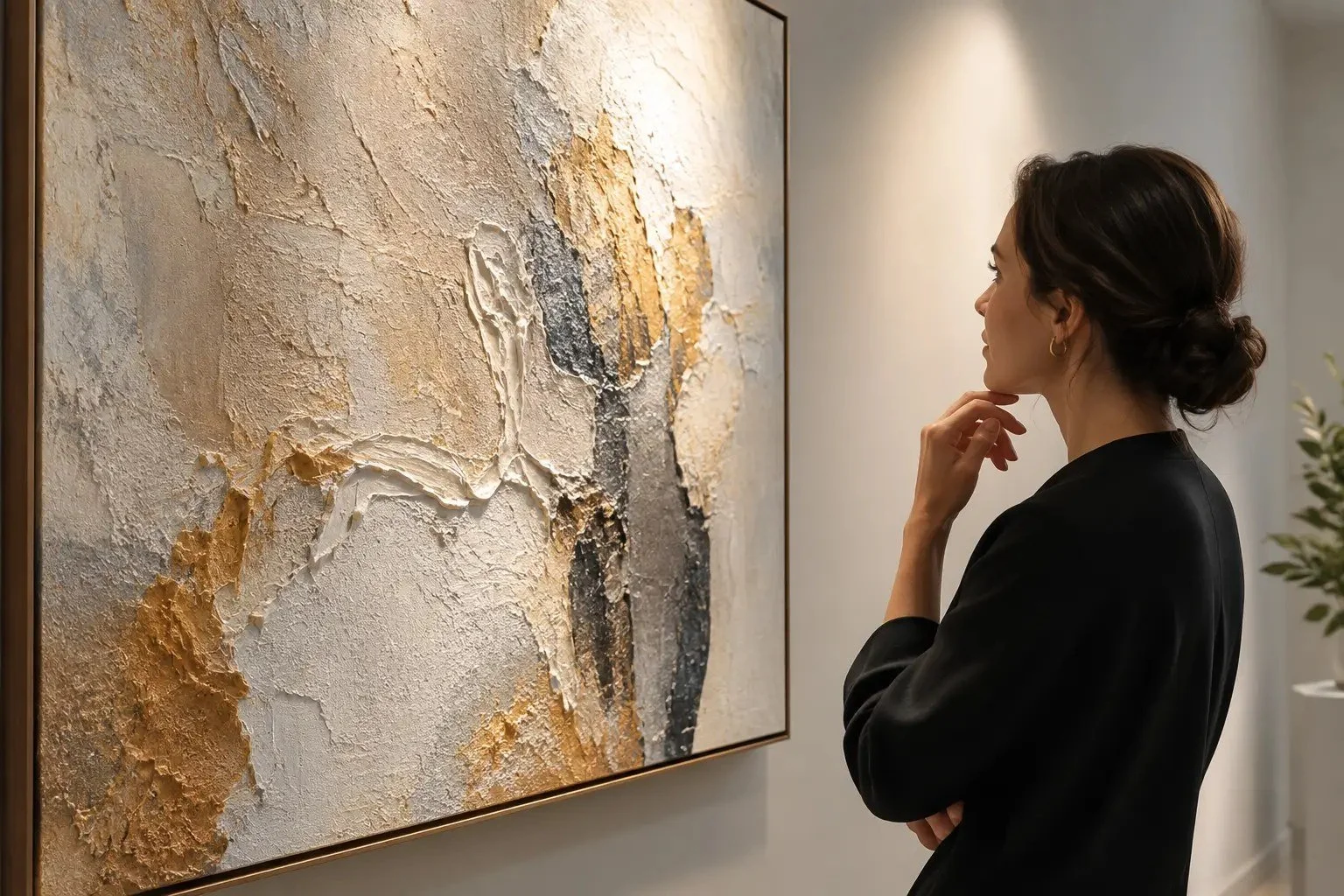
A painting with impasto, a carved panel, a textile or a relief print does not exist on a flat plane. Its surface carries decisions: the pressure of a brush, the build of pigment, a cut edge, a woven thread. Lighting for textured artwork decides whether those decisions are legible, distorted or lost altogether.
The aim is not simply to make the work brighter. For galleries, collectors and homes in Malaysia, good lighting sets up a measured relationship between light, surface and viewer, so that colour stays true while texture registers with clarity and restraint.
Why texture changes the lighting decision
Texture responds to direction. Light arriving close to the viewing axis minimises shadows and makes a raised surface look comparatively flat. Light from a low side angle casts longer shadows and increases the apparent depth of every ridge and fibre. Neither is universally correct.
Heavy impasto usually needs some directional light to keep its physical presence.
Aged works on paper may show cockling, stains or mounting flaws under the same treatment.
Sculpture and relief often rely on shadow as part of their form.
Modest brushwork can turn into a distracting pattern if shadows are too strong.
Lighting for textured artwork begins with angle
A ceiling-mounted accent light aimed at roughly 30 degrees from the wall is a common starting point. It helps reduce reflected glare while giving enough modelling for moderate texture. Treat it as a starting point, not a rule: glossy or unevenly varnished paintings may need more frontal light, while a relief or deeply worked oil may suit a slightly more lateral angle.
Use raking light with discipline
Raking light travels across the surface from a shallow angle. It is valuable for conservation examination and documentation, but it is rarely a neutral display solution. It can exaggerate every imperfection and make a work look more damaged or more aggressively textured than the artist intended. For display, a more measured angle usually gives viewers enough surface information without making shadow the subject.
Control glare before pursuing drama
Texture and gloss often coexist. Thick paint, metal leaf, resin, wax and varnish can all produce reflections that interrupt viewing. Glare is managed by controlling three things:
Where the light comes from
How broad the beam is
What the viewer sees reflected in the surface
Narrow optics can leave a hot spot on a large canvas, while broad floods spill onto the wall and flatten contrast. A fixture and beam chosen for the dimensions of the work, aimed carefully, gives a quieter and more exact result. Explore Nuray Lab's art lighting and products for options.
Preserve colour, not only visibility
On a textured surface, highlights can bleach subtle passages and shadows can make dark pigments look heavier than intended. Look for high colour fidelity across the spectrum, and judge the source on the artwork itself rather than on a single CRI figure. Warm-neutral colour temperatures suit many collections, while cooler light can suit some contemporary work. A faithful artwork reproduction image is a useful reference for checking whether display lighting is pushing colour too warm, too cool or too saturated.
Protect sensitive materials
Light damage is cumulative and irreversible for many materials. Watercolours, drawings, textiles, dyed papers and historic photographs need conservative treatment. LEDs reduce ultraviolet and infrared concerns, but the key questions remain: how much visible light reaches the object, for how long and how often. Dimming lets a work be viewed at an appropriate level rather than a fixed maximum.
Build the viewing environment around the work
Walls and floors: dark walls intensify contrast, and reflective floors add stray light.
Daylight: avoid direct sun, and balance window light with shading and filtration. This matters in bright tropical interiors.
Viewing distance: fine surface detail seen up close needs different treatment from bold relief seen across a room.
Test with the original artwork in place
Start with a restrained light level and a considered angle. View the work from its main position, from the approach path and from close range. Look for glare, hard-edged shadows, uneven coverage and colour shifts, and change one variable at a time.
Frequently asked questions
What is the best angle to light a textured painting?
About 30 degrees from the wall is a common starting point. Adjust it for the depth of texture, the gloss of the surface and where viewers stand.
Should I use raking light to display textured art?
Usually not as the main display light. It is better suited to examination and documentation, because it exaggerates surface relief and flaws.
How do I stop glare on glossy or varnished paintings?
Change the direction of the light, control the beam and check what is reflected at eye level. Lowering brightness alone rarely solves it.
Light your artwork with Nuray Lab
The most successful lighting feels inevitable rather than noticeable. To discuss lighting for textured artwork in your gallery, collection or home in Malaysia, contact us.